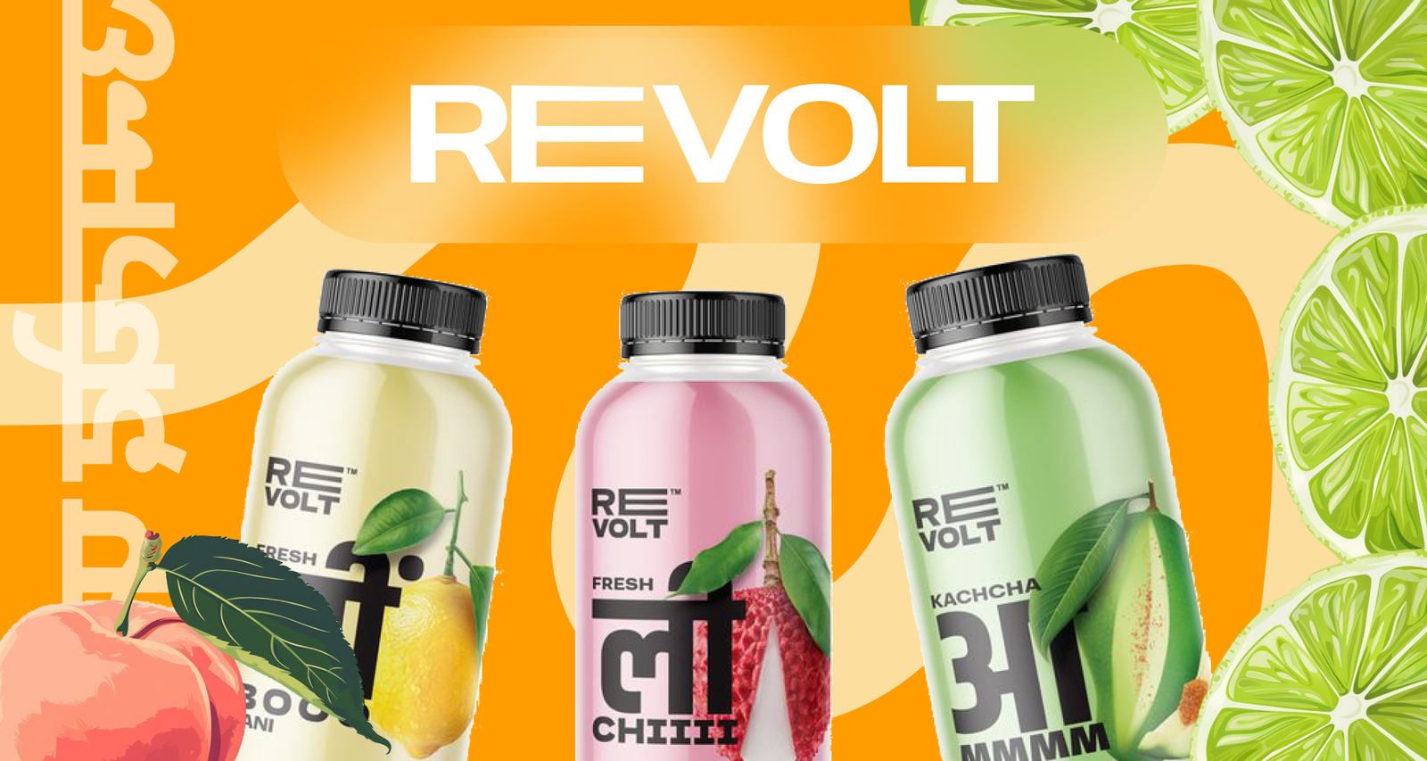
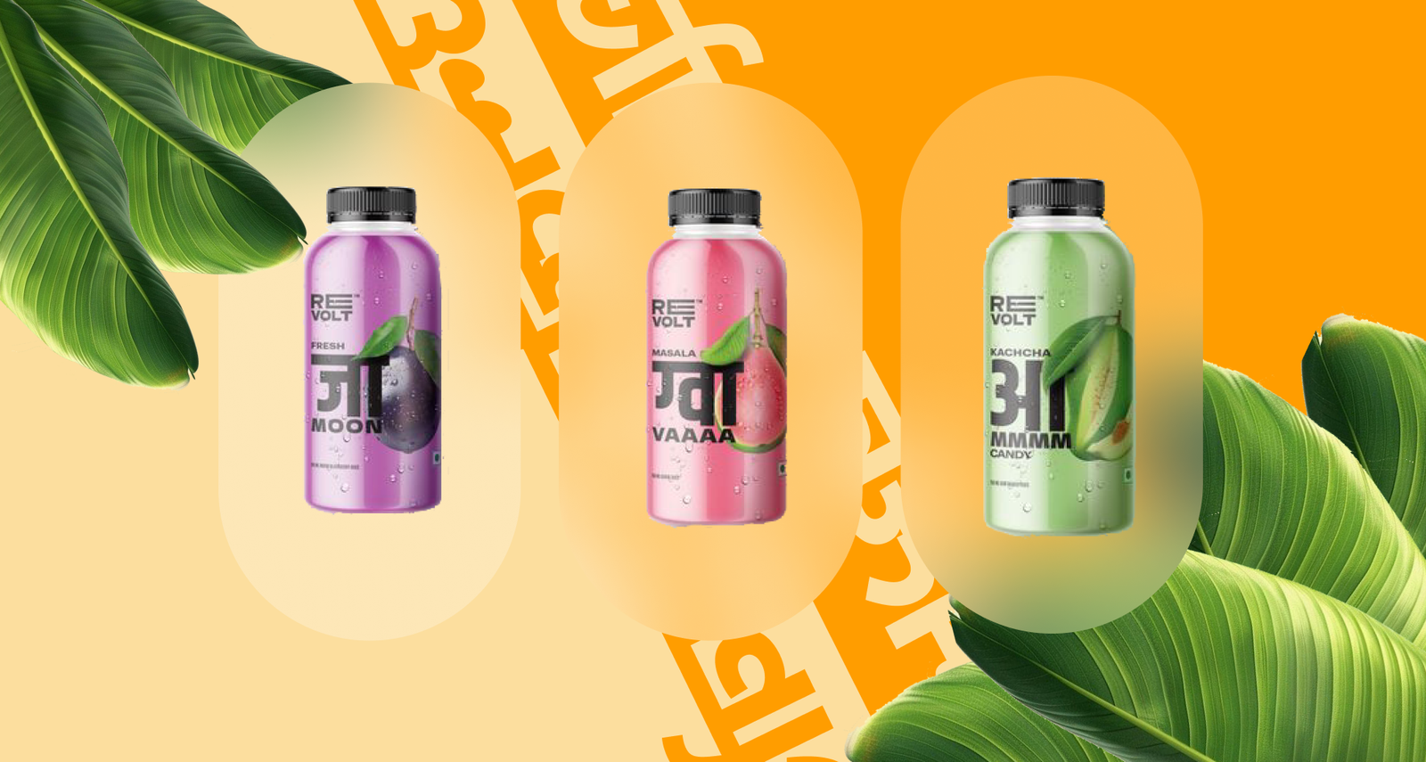
The approach for this design project was to create a loud and colourful visual identity that grabs attention and reflects the bold, energetic spirit of the Revolt fruit drink. Its purpose is to stand out and be different.
During the Revolt project, I realised how much attention to detail is required when developing a brand. I had to think about everything from colour choices to typography, to ensure the final design communicated the brand’s message effectively.
It wasn’t just about making Revolt look good; it was about crafting an experience that would resonate with the target audience and stand out in a competitive market.